How to Resize an Image Without Losing Quality
Choosing the right pixel size makes photos load faster, fit upload limits and stay sharp. Learn how pixels, aspect ratio and file formats work together, with real numbers for web, social media and print.

A photo straight from a modern phone is often 4,000 pixels wide or more. That is great for printing a poster, but far too big for a blog post, an email attachment or a form that only accepts files under 2 MB. Resizing it to the size you actually need makes pages load faster, uploads succeed and inboxes stay happy. Done right, nobody will ever see a difference in quality.
Pixels, dimensions and file size
A digital image is a grid of pixels. Its dimensions are the width and height of that grid, such as 4,032 × 3,024. Multiply them and you get the total pixel count: 4,032 × 3,024 = 12,192,768 pixels, or about 12.2 megapixels.
Dimensions and file size are related but not the same thing. The file size depends on the pixel count, the format and how strongly the image is compressed. Still, fewer pixels almost always means a smaller file, and resizing is the single most effective way to shrink a photo.
Why halving the width quarters the pixels
The key thing to understand is that pixel count depends on both sides. Scale an image to 50% and both the width and the height are halved, so the number of pixels drops to a quarter.
For that 4,032 × 3,024 phone photo:
- 100%: 4,032 × 3,024, about 12.19 megapixels
- 75%: 3,024 × 2,268, about 6.86 megapixels
- 50%: 2,016 × 1,512, about 3.05 megapixels
- 25%: 1,008 × 756, about 0.76 megapixels
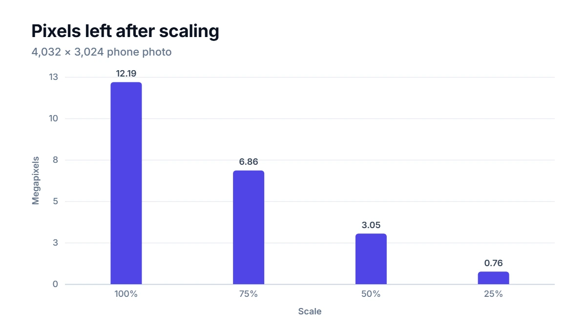
At 25% you keep only one sixteenth of the pixels. That is why a modest reduction often cuts the file size dramatically.
Keeping the aspect ratio
The aspect ratio is the shape of the image, width divided by height. Our phone photo is 4:3. If you change the width and height by different amounts, the picture stretches or squashes, and faces suddenly look wider or thinner.
To keep the shape, change one side and calculate the other:
New height = original height × new width ÷ original width
- Resize the photo to a width of 1,600: 3,024 × 1,600 ÷ 4,032 = 1,200, so the result is 1,600 × 1,200.
- Resize it to a height of 1,080 instead: the width becomes 4,032 × 1,080 ÷ 3,024 = 1,440, so the result is 1,440 × 1,080.
- A 3:2 camera image of 3,000 × 2,000 resized to 1,200 wide becomes 1,200 × 800.
When you need a different shape
Sometimes the destination demands a fixed box, such as a 1,080 × 1,080 square for a profile picture or a social media post. Forcing a 4:3 photo into a square without keeping the ratio squeezes it sideways. The better approach is two steps:
- Crop the photo to the target shape first, choosing which part to keep.
- Resize the cropped image to the exact pixel size.
Cropping removes pixels at the edges; resizing changes the scale of what remains. Using both gives a sharp result in exactly the right shape.
Picking the right size
Some practical starting points:
- Website images: the width the image is actually shown at, often 1,200 to 2,000 px for a full-width photo. Going about twice the displayed size keeps images crisp on high-resolution screens.
- Email attachments: 1,600 to 2,000 px on the long side is plenty for viewing on screen.
- Social media: platforms publish recommended sizes and change them from time to time, so check their current guidelines.
- Print: multiply the print size in inches by 300 pixels per inch for good quality. A 6 × 4 inch print needs 1,800 × 1,200 px.
Choosing a format
- JPEG is the standard for photos. It compresses well but has no transparency.
- PNG is lossless and supports transparency. It is ideal for screenshots, logos and graphics with flat colors, but photos saved as PNG get large.
- WebP handles both photos and transparency, usually with smaller files than JPEG or PNG, and is supported by all modern browsers.
If a resized file is bigger than you expected, the format is usually the reason, not the dimensions.
How to use the Image Resizer
Choose a JPG, PNG or WebP file, and the Image Resizer shows its current dimensions and file size. Type a new width or height with Keep aspect ratio ticked, or switch to Percentage to scale both sides at once. Pick an output format, press Resize, and compare the old and new dimensions and file sizes next to a preview before you download. The whole process runs in your browser, so the photo never leaves your device, and the saved copy does not carry over metadata such as camera details or location.
Mistakes that cost quality
- Enlarging small images. Resizing up spreads the same detail over more pixels. A 600 px image blown up to 2,400 px looks soft because the extra detail does not exist.
- Resizing the same file again and again. Each JPEG save loses a little quality. Always resize from the original, not from an earlier resized copy.
- Ignoring the ratio lock. One accidental change of only the width can distort every person in the photo.
- Uploading full-size photos to a website. The browser scales them down for display, but every visitor still downloads the full file.
- Using PNG for photos. It keeps every pixel perfectly, which is exactly why the files are huge.
FAQ
Does resizing an image reduce its quality?
Making an image smaller removes pixels, but at the smaller size it still looks sharp, because the screen or print could not show the extra detail anyway. Quality only suffers when you enlarge an image or save a JPEG many times.
What is DPI and do I need to change it?
DPI or PPI is a print setting that says how many pixels go into each inch on paper. On screens it does nothing; only the pixel dimensions matter. For printing, the pixel count you need is the print size multiplied by the desired pixels per inch.
Should I resize or compress first?
Resize first, then compress. Resizing removes far more data than compression can, and compressing an image you are about to shrink wastes effort and adds artifacts.
Why does my resized image look blurry on my phone?
Phone screens pack two or three device pixels into every point you see. An image displayed 400 points wide looks sharpest at about 800 to 1,200 pixels wide. If you resized it to exactly 400 px, it will look soft on high-density screens.